Finishing touches on the graphics...
Recently I've worked on the UI of the game. Before it looked like this:
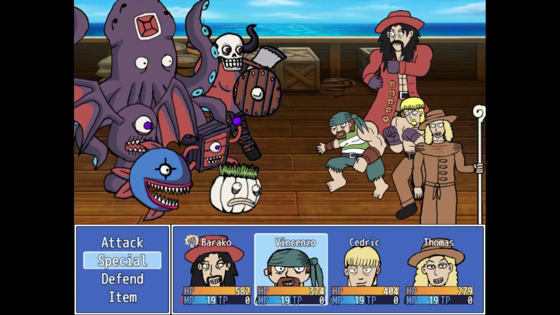
Looks very crappy and boxed in, doesn't fit well with the battlers. Poor Thomas is behind the textbox!
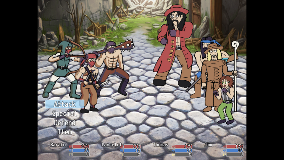
But check it out! The new UI, using the Moghunter script MOG_BattleHud,js...
It was a lot of fiddling around, testing out plenty of different configurations and such, but decided on this minimalist view without backgrounds. The battlers have plenty of room to breathe now! If it would've been the other UI, Hakan would've been behind a textbox...
Sure it's kinda boring and unoriginal, but its practical. About the only customisation I did was drawing up smaller numbers and creating new HP, MP and TP bars, as well as decreasing the size of the turn graphic (the pink box indicating whose turn is it.).
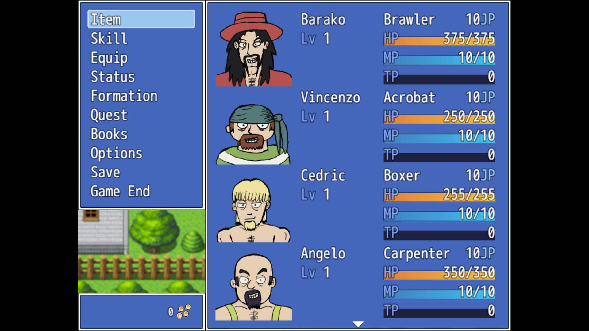
Also attempted to work on the Menu UI of the game. First it looked like this, the default RPG Maker menu...
But changed it to this:
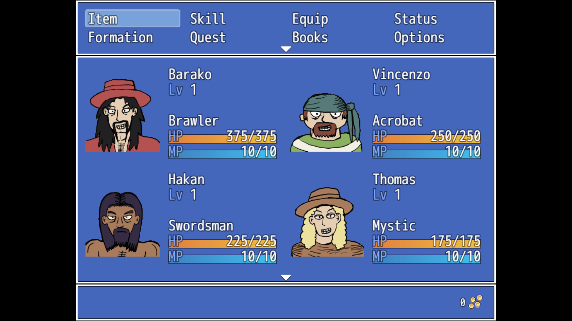
IMO, the new UI doesn't look as good as the old UI, and part of the menu items are missing. Probably gonna just stick with the default. Designing UIs is hard, can't think of any ideas to jazz up the system. Was thinking of the bust UI of SDR, but I dunno, it looks crappy as well. RPG Maker veterans may crap on me for not changing it, but I don't care lol.
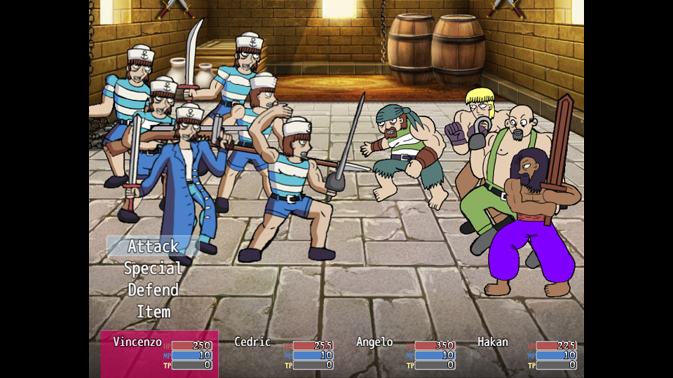
Also been fixing the graphics of my battlers. Been posting on 4chan, and someone in the /agdg/ thread on /vg/ said my art was amateurish.
This is the image I posted:
Asked him why. First he said it was the eyes, and changing them would have a dramatic effect on my art. Then he said my poses and anatomy were all wrong. Looked at it and agreed with him about the poses and anatomy. If you noticed, there's a lot wrong with this screenshot. Lancelot doesn't have his right armband and his right arm isn't thick enough, Thomas's legs are too short, Jim's groin is a pointy line. And if you notice Barako's coat, oh dear, it doesn't have a back, and his arms are too short! Can't believe the hyper critical 4chan didn't pick up on it!
And so I changed them, at least to the best of my ability, to this:
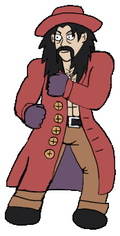

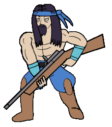
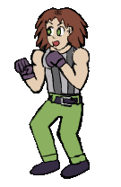
Granted, it's probably not perfect, as you can probably tell I'm not the greatest artist, at least from a technical sense. But they, (at least I hope so) are half-way acceptable now. And as for the eyes... Well I kinda disagree with him/her. I like the tiny pupils. Tiny eyes indicate toughness and masculinity, and its part of the style I'm going for. And having bigger eyes will simply make my art less unique.
Speaking of crappy anatomy...
The new titlescreen!
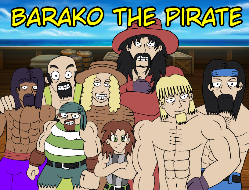
The more artistically inclined of you probably have noticed the tons of anatomical mistakes present in this drawing.
Even though it received a nice comment on twitter remarking that my art should receive more attention, I kinda disagree in retrospect. Its crappy. Used a reference as well, this screenshot I made in Easy Pose...
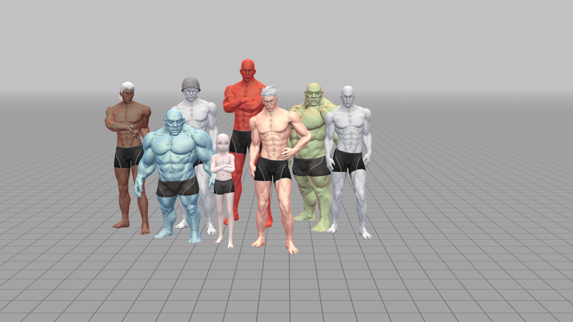
The idea is good, but really need to rework it... Especially poor Vincenzo, he's short, but not THAT short! No wonder I barely receive any likes on Twitter!
Anyway, that's it for the update! If my artwork or game interests you, be sure to follow me! I'm going to release the first part of the game sometime next month, or the month after, so following will inform you of exactly when!
Leave a comment
Log in with itch.io to leave a comment.